on
US Census Bureau Dataset
INTRODUCTION
The goal of this project is to look into the data collected by the US census bureau and identify the features that have significant impact on individual’s income. There are 48,842 instances, mix of continuous and discrete records with fifteen features. Data came originally split into (⅓ test data and ⅔ training data) which I decided to combine them for my analysis and split them later for model development. The following table shows a sample of the data:
 Fig. 1. Sample of data
The last column indicates the class label which is the gross income with threshold of 50K. Prediction task is to determine whether a person makes over 50K a year. The approach that I am taking during this report is to first do some preliminary data analysis to understand data and then build different models and evaluate their performance.
PRELIMINARY DATA ANALYSIS AND DATA TRANSFORMATION
To get some insights and find trends I went over the data, feature by feature and tried to find the impact of each feature on the class label. Before getting started with analysis I realized that there are 2,399 records with at least one missing value. The number was significant and dropping the records was not an option. So I ran further analysis to categorize the records with missing values and the results are illustrated in the following table:
| Records with 1 missing value | 821 |
| Records with 2 missing value | 2753 |
| Records with 3 missing value | 46 |
| Total number of missing values | 3620 |
| Total number of infected records | 2213 |
To handle the missing values I decided to estimate them using 3-nearest neighbor
method. For example to estimate a missing value I find the three most similar
instances and take the vote. This approach makes sense because the number of records
with missing values are high and by estimating the missing fields they can still be valuable. Missing values originally were represented with a single
character of ‘ ?’ in the dataset that I replaced them with NaN value to get advantage of
python’s data mining tools.
Starting with ‘ age ’ column I grouped the values based on their class label and took the average age of the each class. Interestingly the average age of the records who earned equal or less than 50K was 36 and average age of the instances above 50K was 44. The youngest instance was 17 and the oldest 90 years old. I ran the same algorithm using median instead of mean and I got 34 as a median of the records with class label below 50K and 44 as the median of the instances with a label of above 50K. Following figure illustrates the distribution of age in each class.
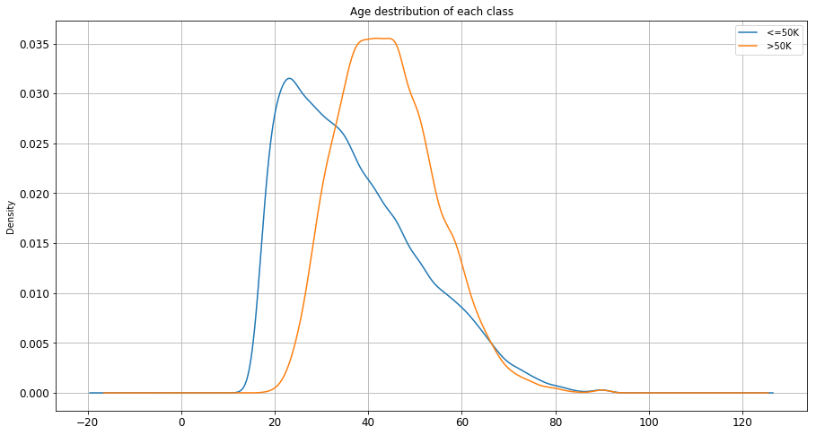 Fig. 2. age distribution in each class
The outcome is reasonable as it was expected. People with higher average age earn more than younger population. From figure 2 there is a sweet spot around age 38, 39 that is a good candidate to be used as a splitting point. I used age 39 to binarize this feature meaning that ages above 39 assigned label 1 and ages below or equal got label 0.
In ‘workclass’ column there are 8 nominal categorical values in total. Values are “Private, Self-emp-not-inc, Self-emp-inc, Federal-gov, Local-gov, State-gov, Without-pay, Never-worked”. To understand the relation between ‘workclass’ and income range I decided to group the records based on their ‘workclass’ value and calculate the frequency of the classes in each category. Following bar chart shows the outcome of this analysis.
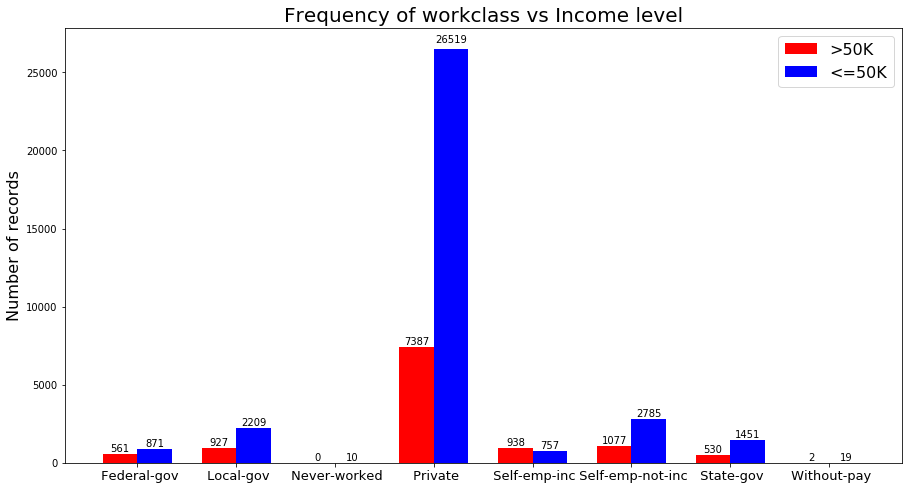 Fig. 3. workcalss vs income
Looking at each pair of bars in figure 3, we can compare the number of people in each ‘workclass’ that has income above and below 50K. For example the number of people who are employed at ‘Private’ sector and earn below 50K are 3.5 times greater than those who earn more than 50K in the same category. ‘Self-emp-Inc’ is the only category that the number of high-income records is greater than the low-income ones. ‘Never-worked’ is the categories that has no record with high income.
To be able to use this feature in my models, I binarized this feature by adding 8 more columns to my dataset with binary values and dropping the original column. Columns named according to the values of this feature and each record got value 0 or 1 depending on it’s value.
Column ‘fnlwgt’ was the most challenging feature to analyze since it didn’t carry any meaning by itself. According to the data description file, ‘fnlwgt’ is a shortened name for final-weight which is a kind of a measure consists of number of several attributes. This is a feature with continuous values in interval [ 12285, 1484705 ]. To understand this feature I plot the distribution of this feature in each class.
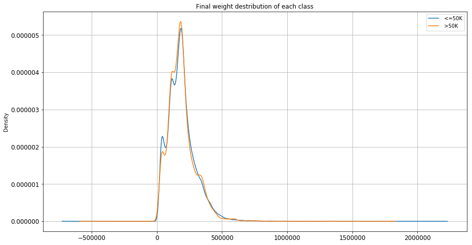 Fig. 4. fnlwgt distribution in each class
As it can be seen from Figure 4, distribution of this continuous feature is almost identical in both categories. Meaning that records with the same ‘fnlwgt’ value can be equally likely in either of the classes. This is indicating that this feature is not providing value for our analysis. So I decided to drop this value during Model developing.
‘education’ and ‘education-num’ are representing similar ideas but in different format. ‘education’ has string values and ‘education-num’ has integer values showing the number of years that an instance has studied. I decided to pick ‘education’ for my analysis and use ‘education-num’ in my models. I grouped the similar values together and calculated the percentage of high income and low income in each category. The following stacked bar-chart illustrates the results:
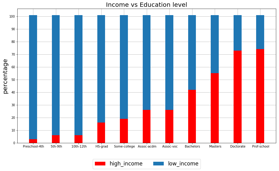 Fig. 5. education vs income level
Observing figure 5 there is a positive strong correlation between ‘education’ column and class label. As the level of education increases the percentage of records with high income increases as well. Proportion of high-income Instances among those who are not graduated from high school is less than 10% where the proportion of high-income records with masters degree or higher is above 50%. I dropped the ‘education’ column after my analysis and kept ‘education-num’ column for using in my models. Since the values of this feature are integers and they can be used both as categorical and continuous, I decided to keep them as is.
Analyzing ‘marital-status’, I grouped all the values and get the frequency of the class label in each category. Following histogram shows the results:
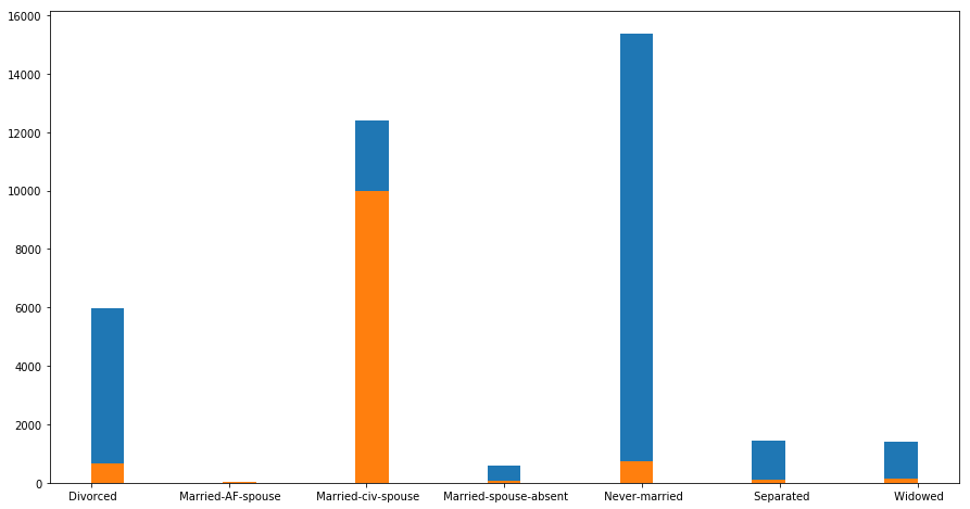 Fig. 6. marital status vs income level
Looking at figure 6, in category ‘Married-civilian-Spouse’ records with income level over 50K is dominating compared to the other categories where most of the instances have income below 50K. This is a good indicator of a class label and provide us valuable information. To use this categorical feature in my models I binarized the values and add seven more columns to my matrix having binary values. After transformation I dropped the original column.
To analyze the ‘occupation’ column, since it is a categorical feature I grouped them in categories and plot the following bar chart for comparison:
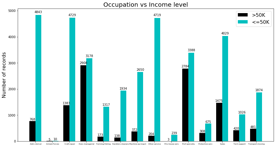 Fig. 7. occupation vs income level
Looking at figure 7, we can see that there is no single category that the number of records with high income exceeds the ones with low income. But in some categories like ‘executive managers’ number of instances in each class are close to each other. On the other hand in categories like services, the difference between two classes is extreme. By looking at the results we can identify a significant correlation between Occupation and class label which can help us in our predictions. To transform this feature to a usable format in my models I binarized the values by adding columns with the name of each categorical value and I dropped the original column.
For the categorical features I follow the same approach and following are the results for three different features ‘Relationship’, ‘race’ and ‘sex’.
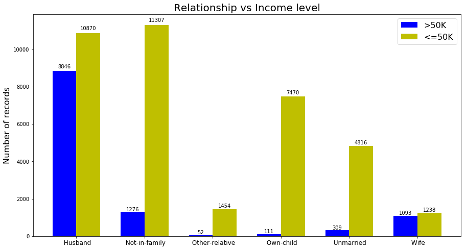 Fig. 8. relationship vs income level
The term ‘relationship’ and it is relation to Income level was a little bit ambiguous for me. And I had problems understanding this feature. But just plotting this feature we can see that there is a significant correlation between this attribute and income level. Although in all the categories, the number of instances with high income are lower than the ones with lower income but the difference is not the same. For example in the category ‘Husband’ the number of instances in each class are close to each other.
For transformation I binarized the values and add new columns to the data set and dropped the original feature.
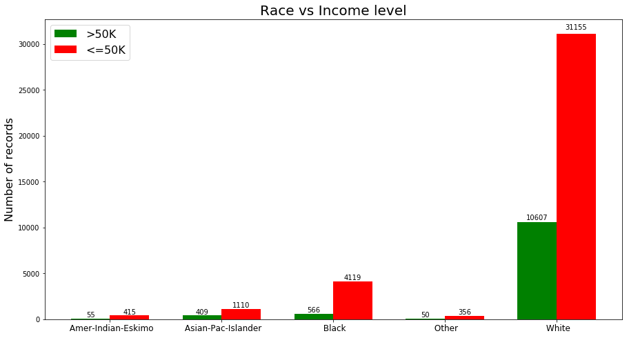 Fig. 9. race vs income level
As we can see from figure 9 the majority of the instances are white. The proportion of the instances in each category is different and this can tell us about the significance of this feature. For example in category ‘Black’ number of low-income records are seven times greater than high-income records, where in category ‘White’ the number of low-income instances are three times greater than the high-income instances.
I binarized this feature and add new columns to my Data and dropped the original column.
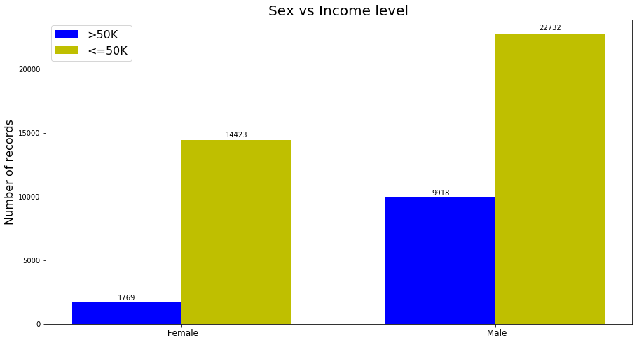 Fig. 10. sex vs income level
Figure 10 shows the distribution of classes in different categories. The proportion of the classes are very different and this makes this feature important. The ratio between high-income and low-income in ‘male’ category is 2.3 where this ratio in ‘female’ category is 8. Meaning that more instances in ‘female’ category are getting paid lower than 50K. To use this feature in my models I mapped the values to zero and one.
The following figure shows the distribution of capital-gain in each class:
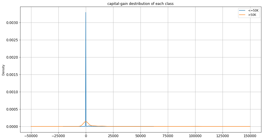 Fig. 11. capital-gain distribution
The majority of the records have zero capital-gain. Interestingly records in both of the classes shows similar behavior. Although one might expect to see more gain in high-income class but the difference is not dramatic in this case.
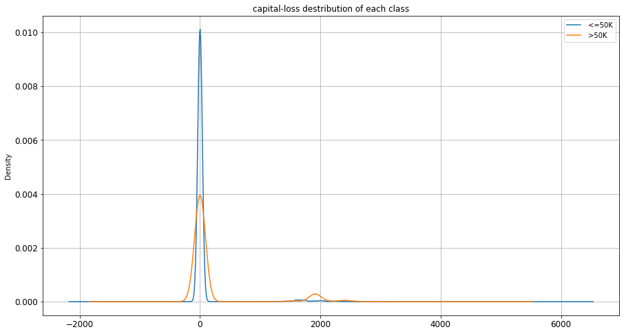 Fig. 12. capital-loss distribution
Capital loss also shows the same kind of behavior as capital-gain. In figure 12, distribution of capital-loss in both classes are very much similar.
Model Development and Evaluation
I developed five different models for this project following are the results of the model’s performance:
model A: Decision Tree
| Recall | 0.946 |
| Precision | 0.872 |
| Error Rate | 0.147 |
| Accuracy | 0.852 |
| F1 Score | 0.907 |
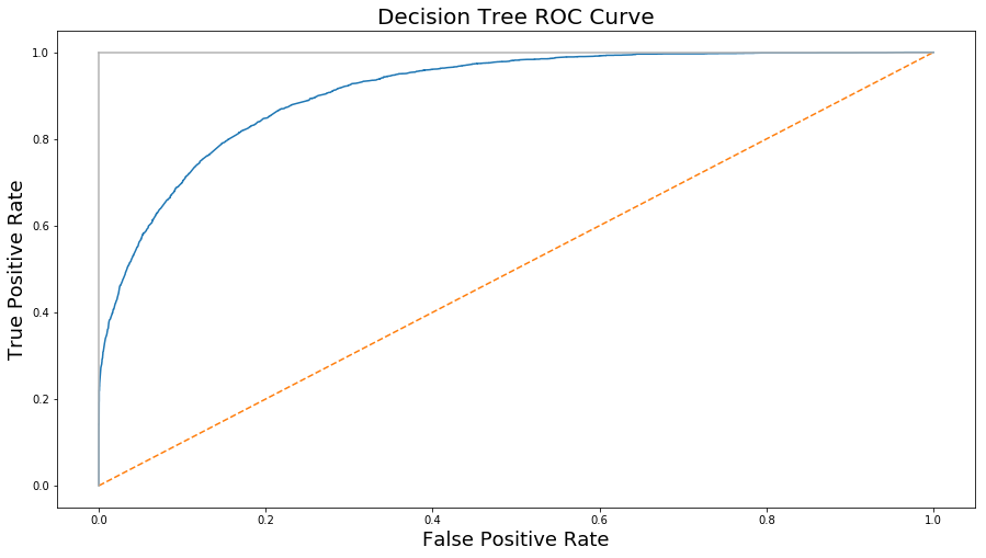 Fig. 13. Decision Tree ROC curve
model B: Artificial Neural Network
| Recall | 1 |
| Precision | 0.764 |
| Error Rate | 0.235 |
| Accuracy | 0.764 |
| F1 Score | 0.866 |
 Fig. 14. Artificial Neural Network ROC curve
model C: Support Vector Machine
| Recall | 0.75 |
| Precision | 0.91 |
| Error Rate | 0.24 |
| Accuracy | 0.757 |
| F1 Score | 0.826 |
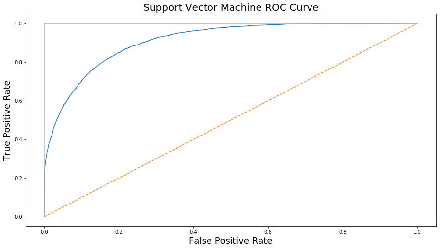 Fig. 15. Support Vector Machine ROC curve
model D: Ensemble Learner (Adaboost)
| Recall | 0.935 |
| Precision | 0.886 |
| Error Rate | 0.14 |
| Accuracy | 0.859 |
| F1 Score | 0.91 |
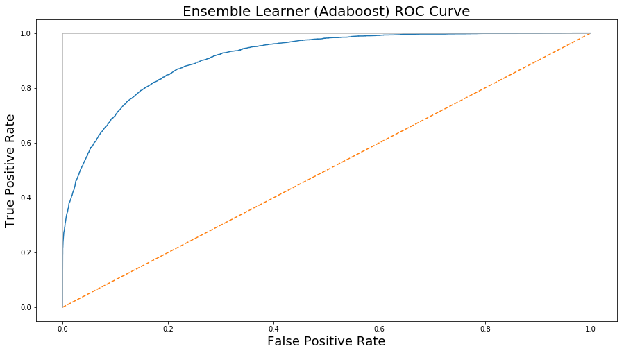 Fig. 16. Adaboost Model’s ROC curve
model E: Logistic Regression
| Recall | 0.93 |
| Precision | 0.88 |
| Error Rate | 0.147 |
| Accuracy | 0.85 |
| F1 Score | 0.906 |
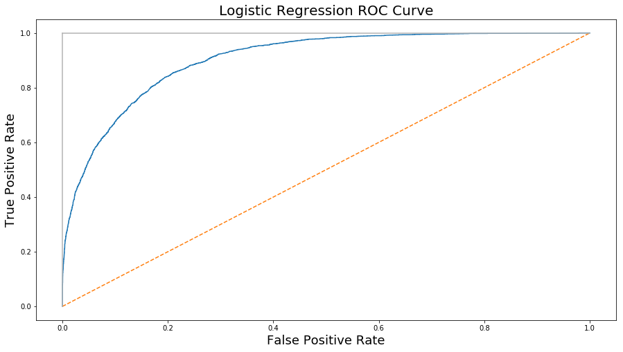 Fig. 17. Logistic Regression ROC curve
Result
The Ensemble Learner (Adaboost) did the best among all the models with a F1 Score of 0.91 and Decision tree placed second with F1 Score of 0.907. Logistic regression model did very close to decision tree model with a F1 score of 0.906 and there were not a huge difference among them. But two other models ANN and Support Vector Machine did weaker compared to the prior models. ANN model got the F1 Score of 0.86 and SVM got the F1 Score of 0.82.